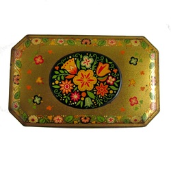
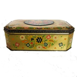
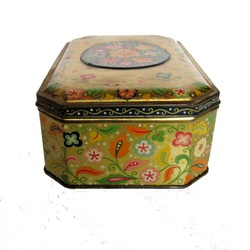
 This is the latest, vintage tin added to my website. This one has a really nice folk-style design on it, with a raised oval of flowers on the lid, and lots of folky, retro flowers, leaves and vines decorating the sides. The colours are really vibrant, and the gold is a really deep, rich gold. It's a lovely thing.  Made for Carr's of Carlisle, I can date this to pre-1972 as Carr's were taken over by United Biscuits then, and there is no mention of United Biscuits on this tin.  The hinged lid has a nice, tight fit, so I think this tin would make a great seed packet storage tin because it would definitely keep the moisture out.
0 Comments
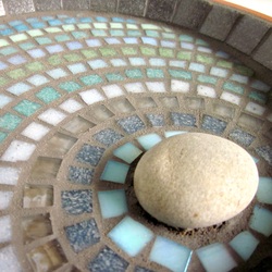 A slight change of shades of colours used in my Ripple bird bath design, and I've got a whole new mood and feel to this one. With the slightly darker shades, and the lighter pebble it's got a feel of the moon, and moonlight being reflected into water. I love creating this Ripple range, although it's a fairly simple design, the ripples mean I have quite a large palette to work with, and each finished item has a completely unique feel to it. 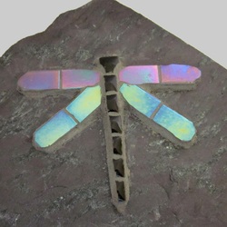 I've been on the hunt for some nice pieces of slate to add my mosaic to. I found a fantastic piece of purple slate, that was perfect for one of my mosaic dragonflies. It's got grey marbling through it, so the grey iridescent tiles that I use for my dragonfly work really well with it. And the shape of the slate couldn't be better. It's got a lovely smooth surface, and it's slightly angled upwards to a point. So the dragonfly's wings are angled up to the light which means the iridesence shines. It would be great in the garden to add colour to a border, or by a pond, or on a patio, or on a deck, or in a pot..... 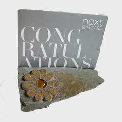 The other piece of slate that I got was a smaller piece that I was originally thinking I would use as a paperweight. You still could. But when I turned it over, I found the natural split that it had in it. I tested a giftcard in it, and found it would make quite a good letter rack. Or it would actually make quite a good door stop as it's slightly wedge-shaped too. Or you could use it in the garden as an ornament all the materials are frostproof. The daisy colours were chosen because there is a tan colour on top of the grey slate, and the colours tie in perfectly. 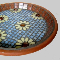 The idea for this bird bath came from the amber glass nuggets that I've just bought. They reminded me of flower centres with a drop of water on them. So, first, I had to choose a petal colour . I chose cream because with the amber they made a really nice, vintage-fabric-look, daisy flower. Next was the background tile choice. I decided sky blue would blend in really nicely, and set off the flowers without overpowering them, or the flowers becoming too bold either. Finally, a border choice. I could have continued with sky blue around the edge too, but I wanted to keep the blue and the flowers as the central design, so I 'framed' it with terracotta to blend in with the terracotta saucer base. The finished bird bath has a lovely country-rustic feel to it. And it all came from the amber glass nuggets creating an idea.  This time, the detective work was on this really great retro tea caddy. The design is of a gramophone, with swirls of shells, flowers, and musical notes. The colours, and style of design, are very evocative of the 60's, but there is no date on the tin. There is a sticker for the retailer on the bottom, which has an address, but no postcode. A bit of research and I've found out that Croydon, which is where the company were based, first started using postcodes in 1967, so I'm pretty sure the tin dates to before then. And with the design, and colours, I would guess at early to mid 60's. Whatever the exact date, it's a really nice tin, in really good vintage condition 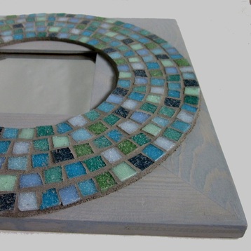 This Faded Blue and Green Circle mirror has a very calming feel about it. I think that's partly due to the mosaic being circular, which means your eye just travels around it without any harsh angles disrupting it. Also the colour palette used is very muted, and gives an almost sun-bleached effect which makes me think of beach huts, the sky, and the sea. All very calming images. Finally the faded blue/grey woodstain on the mirror frame means it adds to the faded, sun-bleached feel. Colours and design creating a feeling and mood. 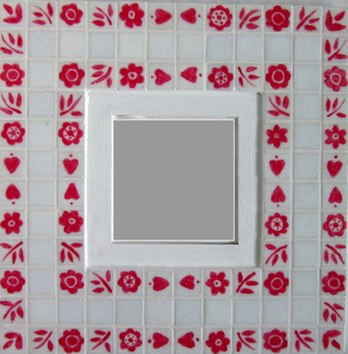 This idea came to me the other day when I was putting together a list for my vintage selling site of Vintage European tourist souvenirs, ones that I liked and would buy. When I'd got the items all together I noticed there was a very strong folk art theme to them. I have always liked Swedish Folk Art so I decided that would be the design for my next mosaic mirrors. I have handpainted the folk symbols onto the tiles, then fixed the paint to give a durable finish. The first one I made was this Red and White version. It's the traditional colours I think of when I think of Swedish Folk Art. I painted over the bare wood with white gloss to give a clean, bright, slightly shabby chic, finish. The strips of pattern also remind me of embroidered trim. 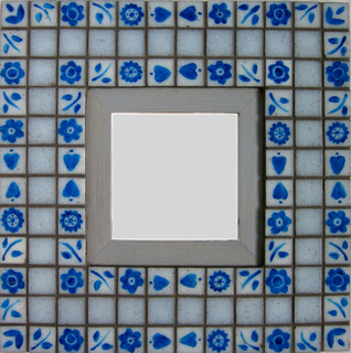 The second version I've made is another, what I think of as traditional, Swedish country folk style colour combination of pale Blue and Grey. This time the design is painted in blue onto pale grey tiles, the plain tiles are pale blue, and the bare wood of the mirror has a blue/grey woodstain which has a nice, sunbleached, faded effect to it. The handpainting, fixing, and then making the mosaic, makes this mirror pretty labour intensive, but the results are worth it, I think. 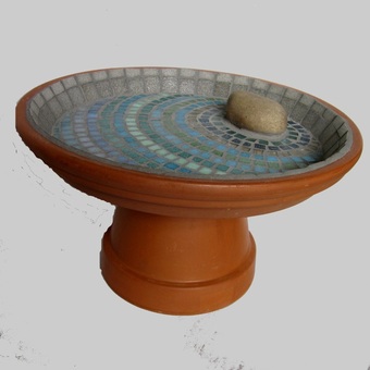 I've used a slightly more muted set of colours on this Ripple Bird Bath, and it's come out really well. It looks like the colours are slightly sun-bleached. Which, of course, will never happen, as the beauty of these glass mosaic tiles is they are fade-resistant. So this faded-effect will stay at this shade even in bright sunshine. Perfect. The stone I've used in this bath is slightly larger than I've used previously too, but I think the scale of it fits the large size (31cm) saucer that I've used. I was thinking about making a matching base, but I'll leave that to the purchaser to decide if they want a base or not, and if they want the pedestal plain, or matching coloured mosaic. 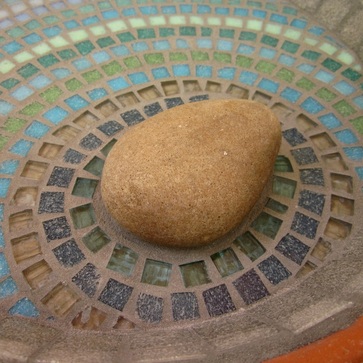 Although I repeat this Ripple pattern a lot in my items, each one is completely unique. I start with a blank palette everytime and build it up as I go. Each design will be using slightly different colours, in a different order, so no two Ripple Bird Baths will be the same. The beauty of handmade. |
JoSara BlogSome of the stories behind the design processes of the home and garden mosaics found on JoSara.co.uk. Follow me on Facebook to see the items as they are being made and to get the most up to date stock info. To get these blog posts sent direct to your email, click the link below to follow the feed -
Archives
December 2023
Categories
All
|